Even with the best print shop setup, it’s frustratingly easy to end up with poor final output when printing onto textiles. So how can you make sure the final product looks as good as the version on your screen?
In this post, we’ll explore issues like colour management, resolution, bleed, stretch-fabric issues, and media shrink when calendaring – so your media delivers the impact your clients expect.

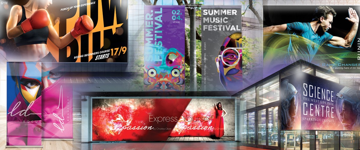
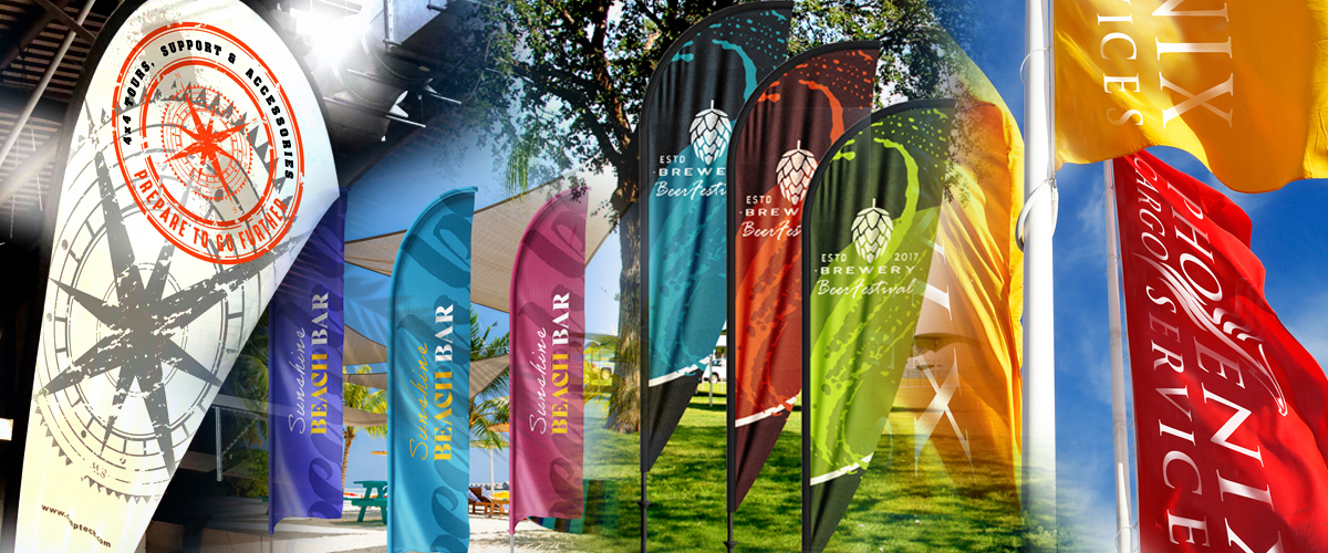
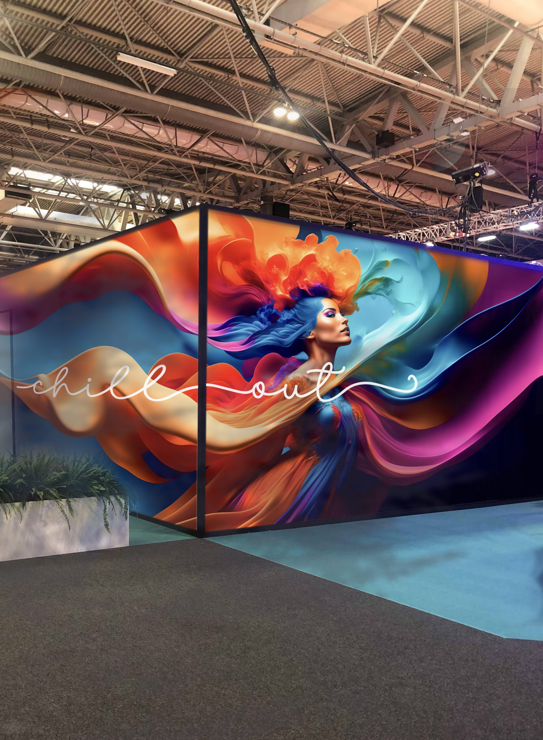
Whether you are producing tension-frame graphics, backlit displays, exhibition graphics, flags, or other textile applications, your artwork needs to account for the full production process, including colour management, image resolution, finishing, stretch, and any dimensional changes caused during printing or heat fixation.
A file can look perfect on screen but behave very differently once it has been printed, calendered, cut, sewn and tensioned into a frame.
What’s going wrong?

1. The colours on your screen don’t match what’s printed
On your screen, the colours pop. So why does the print look… different? The answer lies in your monitor’s calibration and your printer’s ability to print the full gamut (i.e. range) of colours that appear on it.
You’ll probably notice the difference most with particularly bright or neon colours, solid blacks, and large blocks of a single colour (which creates more opportunity for inconsistencies to show up). Here’s how to tackle it:
- Work with a calibrated and profiled monitor: A properly controlled display provides a much more reliable reference when assessing colour.
- Use the correct ICC profile: for the printer, ink, print mode and textile combination. Profiles should represent the complete print condition, not just the printer model.
- Pay particular attention to brand colours, greys, neutrals, and highly saturated colours: These can quickly expose differences between the artwork colour space and the printable gamut.
- Stick to CMYK (not RGB): Most digital textile printers are calibrated to use CMYK along with additional colours such as orange, green, violet and neon colours to achieve the widest gamut of colours.
- Produce a colour proof or test print when colour accuracy is critical: This is especially important for large areas of solid colour and colour-sensitive corporate graphics.
The textile also plays an important role. Different constructions, coatings, whiteness levels and surface characteristics can affect colour density, contrast and perceived saturation.
2. The result is fuzzy (or takes forever to print)
One of the most common artwork problems in wide-format printing is insufficient image resolution at the final output size.
The important figure is the image’s effective resolution at the finished size, not simply the resolution shown in the original file. For example, enlarging a 300 dpi image to four times its original dimensions reduces its effective resolution to 75 dpi.
The required resolution depends on the application and expected viewing distance. A textile graphic designed to be viewed from one metre away requires more detail than a large exhibition graphic positioned several metres from the viewer.
Avoid using arbitrary resolution figures for every job.
Instead:
- Check the effective image resolution at the final reproduction size.
- Consider the expected viewing distance.
- Avoid unnecessarily large files containing far more image data than the application requires.
- Where possible, keep logos, lettering and other graphic elements as vector artwork.
- Inspect important raster images at output size before sending the file to production.
Your RIP and production workflow may also have specific recommendations for artwork resolution.
3. Finishing leaves white borders or misalignment
Textile graphics are rarely simply printed and trimmed.
Depending on the application, the finished graphic may be sewn, hemmed, fitted with silicone edging, eyeleted, pole-pocketed or tensioned into a frame.
The artwork therefore needs to be prepared for the finished application, not simply the printed dimensions.
For example, with silicone edge graphics (SEG), the printed textile may require additional material outside the visible area for cutting, sewing and fitting the silicone strip.
When preparing artwork:
- Extend backgrounds and images beyond the visible finished area where required.
- Keep logos, text and important graphic elements away from finishing and sewing areas.
- Allow for the tolerances required by the specific finishing method.
- Use the dimensions supplied by the frame, finishing system or production department rather than assuming a standard bleed will work for every application.
- For repeat work, creating templates for individual frame systems and finishing methods can significantly reduce production errors.
4. Stretching distorts the details
Textiles behave differently from rigid media.
Stretch fabrics used for tension-frame systems are deliberately designed to tension within the frame. As the textile stretches, the printed image stretches with it.
This becomes particularly noticeable where the artwork contains:
- fine lines
- borders
- geometric patterns
- circles
- small text
- closely positioned logos
- graphics that need to align with the edge of the frame
The amount of movement depends on the textile construction, direction of stretch, frame system, and finishing method.
For applications where dimensional accuracy is critical, test the complete print and finishing workflow and adjust the artwork accordingly.
A narrow border that looks perfectly even in the artwork, for example, can quickly highlight even small differences in stretch or finishing once installed.
5. Shrinkage ruins the results
For dye-sublimation textile printing, heat is normally required either to transfer the image from sublimation paper onto the textile or to fix directly printed sublimation inks.
During this process, some polyester textiles can change dimensionally when exposed to heat and tension.
The amount of change varies between products and production conditions. This is especially important when producing graphics that must fit accurately into a frame or align with adjoining panels.
Rather than applying a generic compensation figure:
- Check the technical information for the textile being used.
- Establish the material’s behaviour on your own production equipment.
- Maintain consistent calender temperature, pressure, speed and web tension.
- Record compensation values for repeat production where necessary.
- Test unfamiliar media before committing to a large production run.
The objective is a controlled and repeatable workflow rather than compensating for shrinkage by guesswork.
6. The artwork has been designed without considering the application
The best textile is not necessarily the same for every graphic.
A backlit textile, stretch display fabric, blockout textile and flag material will each have different characteristics.
Artwork should therefore be considered alongside the intended application.
For example, a backlit graphic may need stronger control of density and contrast because the image will be illuminated from behind. In contrast, a stretch-frame graphic may need greater consideration given to edge detail and image distortion.
Selecting the correct textile at the start of the project can make both artwork preparation and production considerably easier.
Build the artwork around the finished application. Successful textile printing is about more than selecting the correct print settings.
The artwork, textile, printer, ink, colour profile, heat process, finishing method and display system all form part of the same production workflow.
Understanding how these elements interact helps reduce wasted media, unnecessary reprints, and installation problems.
Soyang supplies a wide range of printable textiles for applications including tension-frame graphics, backlit displays, exhibition graphics, flags and retail displays.
If you are unsure which textile suits a particular application, talk to the Soyang team, and we can help you choose the right material for the job.
Talk to Soyang
Want to find the right display fabric for your project? Talk to us