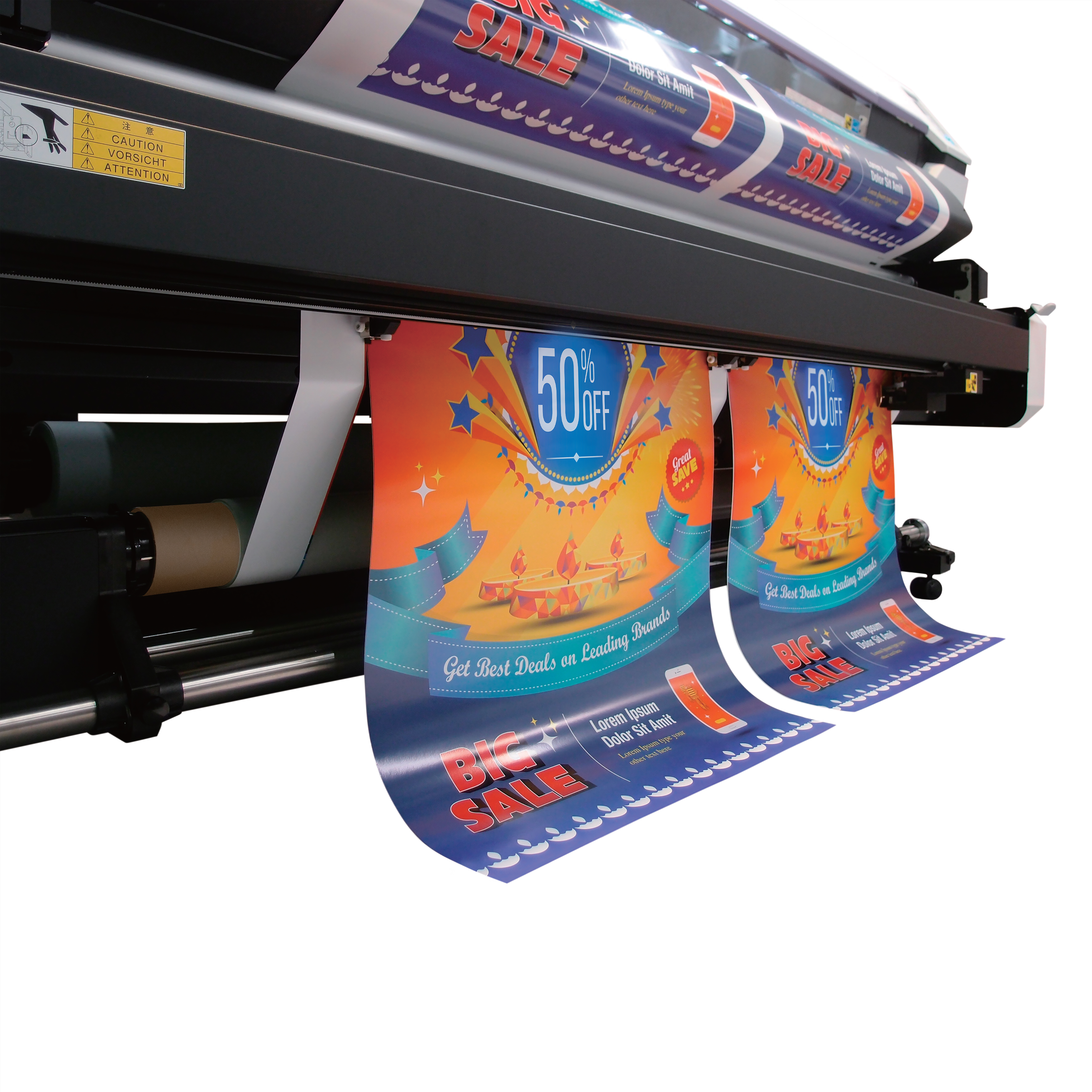
How can you ensure your large format printed products look as good as a) they did on screen and b) as each other? The secret lies in effective print colour management. Here’s how to achieve it.
Red is red. Blue is blue. Sure, the shades may differ, but show the same shade to two different people and they’ll see the same thing. At least, that’s what you might assume, except it isn’t true. Research shows there’s nothing objective about colour. We all see the same colours differently.
For any print manager trying to deliver a printed banner with colours identical to those the client saw on their screen or on their previous banner, that rather stacks the odds against them. And that’s before you realise that, from colour process to print material to printer, every print job features a range of elements that can slightly alter the colour of the product you print.
So what are these elements, and what colour management printing techniques can you employ to ensure the colours you print are the colours you want?
Printing colour management tip 1 – Use the same printer
Big print runs will be completed faster (and therefore more economically) when you use multiple printers. But the more printers you set to work on a project, the greater the variables in colour matching.
It’s often a trade-off between economics and print quality but, where you can, use the same large format printer throughout the job.
Colour management printing tip 2 – get a sample
‘Well it doesn’t look like the banner we had printed last time…” As we’ve already seen, everyone sees colour differently. It may also be the case that the banner a client had printed last time was a mile out of tolerance but they simply never realised.
You could present them with large format printing with the truest possible colour reproduction and they wouldn’t like it because it’s simply different.
To avoid such problems (and if possible) ask for a sample of the last piece of print. Providing it hasn’t become too faded or cracked, it could help you colour match.
Printing colour management tip 3 – Print CYMK colours, not RGB
The image you see on screen will be rendered using the RGB colour system.
RGB (red, green, blue) starts with a black base and adds different degrees of those three colours to create an almost infinite variety of colour (red and green to make yellow, blue and red to make magenta and so on). Whenever you add a colour to the black base it makes the darkness appear brighter, which is why colours on your phone screen appear so incredibly bright.
The image you print, however, has a different delivery method. Here CYMK (cyan, magenta, yellow, key (black)) is a subtractive process. Add a colour and light is removed, the direct opposite of RGB. CYMK simply can’t produce the range or brightness of RGB colours. Yet virtually all large format print uses CYMK.
Print RGB colours through a CYMK printer and the result will be a ‘best fit’, with the print management software doing its best to print match an incompatible colour. Ultimately your banner will look considerably duller than the version on screen.
The solution is to print in the CYMK colour space by converting from RGB to CYMK before printing. The result still won’t ‘pop’ quite as much as the on-screen original, but it will be a much truer colour match.
Print colour management tip 4 – Work with vector images
It’s not so much a print colour management issue, rather an overall image quality matter, but many image files (that is, files with a .jpeg, .gif, .tiff, or .png suffix) create their images using thousands of tiny pixels. These ‘raster’ images look perfectly clear when used at their original size or smaller, but when you try to scale them up you lose resolution and the image can become pixelated.
Vector images (that is, .svg and many .pdf files) maintain resolution however much you scale up or down. For large format printing, converting raster to vector images using conversion software is essential.
Colour management printing tip 5 – Use the same print stock
The material you print on will have a profound difference on the end result in terms of vibrancy and colour reproduction. Switching one grade of vinyl for another mid-run will almost inevitably lead to a difference in colour reproduction between banners.
Ensure, therefore, that before you begin any multi-product print project, you have enough of the same vinyl/canvas/mesh to finish the entire run.
That’s something we can help with. For all large format print materials, and colour management printing advice for all our products, talk to us now.
